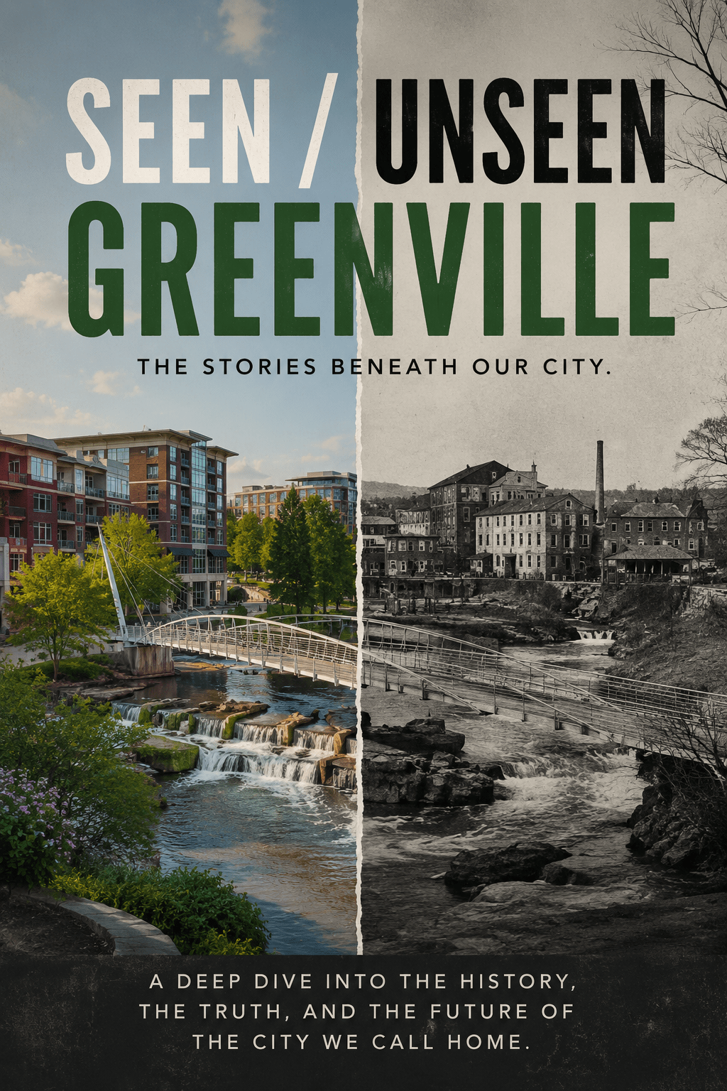
The Map You Don’t See
If you laid a map of Greenville County on the table and marked school performance, it would look one way.
If you marked income levels, it would look another.
But when you put them together, the two maps start to overlap.
Not perfectly.
But clearly enough to notice.
What We’re Measuring
To understand what that map looks like, you have to define what you’re actually seeing.
Across Greenville County Schools, two patterns show up again and again. One is the percentage of students considered economically disadvantaged. The other is the state’s school report card ratings.
Those ratings—published through the South Carolina Department of Education—range from Excellent to Unsatisfactory. They aren’t perfect, and they don’t capture everything that happens inside a school. But they are consistent enough to compare, and over time, they begin to tell a story.
What the Map Shows
When you start lining those measures up, a pattern begins to emerge.
Not everywhere. Not without exceptions.
But clearly enough to see.
In schools like Tanglewood Middle School, where roughly 85 to 90 percent of students are considered economically disadvantaged, performance ratings tend to fall in the Below Average range. At Berea High School, where that number sits closer to 70 to 80 percent, the ratings often land between Below Average and Unsatisfactory. Lakeview Middle School shows a similar pattern, with higher poverty levels and ratings that hover between Average and Below Average.
These schools are not outliers.
They form a pattern.
A different pattern appears in places like Riverside High School, where the percentage of economically disadvantaged students drops closer to 10 to 20 percent and ratings consistently land in the Excellent range. At Eastside High School, the numbers follow a similar trend. JL Mann High School sits somewhere in between, with a more mixed population and ratings that still tend to fall between Good and Excellent.
Same county. Same system.
Very different conditions.
Schools like Carolina High School and Southside High School sit somewhere in between.
They serve more economically mixed communities, and their outcomes tend to reflect that—often landing in the Average range, sometimes shifting over time as the surrounding areas change.
They don’t fit cleanly into either side of the map.
But that’s part of the point.
This isn’t a simple divide.
It’s a gradient.
The Distance Between Them
What makes this harder to see is how little distance there is between these places.
In Greenville, this isn’t a matter of different regions or separate districts. You can move from one of these school zones to another in fifteen minutes or less.
The map isn’t spread out.
It’s layered.
What It Looks Like in the Classroom
The lines you can’t always see across the city are often easiest to recognize in its schools.
I’ve seen this from the inside.
I’ve taught in both Greenville County and Pickens County, and the differences aren’t abstract.
In some places, the need is immediate and visible—students dealing with instability, gaps in basic support, things that don’t show up on a report card but shape everything that happens in a classroom.
In others, the environment looks very different. At Greenville Middle School, resources and support systems are more consistent. At Hughes Academy of Science and Technology, you see something in between—a more mixed set of conditions, with outcomes that reflect that mix.
What becomes clear over time is not that one group of students is more capable than another.
It’s that they’re starting from very different places.
And schools often end up reflecting the communities around them. The areas with more resources tend to have more stability built in—both inside and outside the classroom. The areas with less are asked to carry more.
That’s not a judgment.
It’s a pattern.
Because until basic needs are met—at home, at school, somewhere—it becomes much harder for students to fully engage, no matter how capable they are.
Why This Happens
Schools don’t exist outside their communities.
They reflect them.
Where people live shapes where their children go to school. And where those schools are located influences everything from funding to stability to opportunity.
Housing patterns shape school zones. School zones reinforce housing patterns. Property values influence what resources are available, what expectations are set, and what support systems exist outside the classroom.
And all of it sits on top of older decisions—about where people could live, where investment flowed, and where it didn’t.
None of this is new.
But it continues.
What This Doesn’t Mean
It’s easy to look at a map like this and draw the wrong conclusions.
It doesn’t mean that students in one school are more capable than those in another. It doesn’t mean teachers in one building are working harder than those in another. And it doesn’t mean outcomes are fixed or unchangeable.
What it does mean is simpler—and harder to confront.
The starting conditions are different.
The Hard Question
Greenville is not a struggling county.
It’s growing. It’s attracting investment. It has resources.
Which raises a harder question.
If the need is visible—and it is—what would it look like to respond to it more directly?
The Map, Revisited
The map is already there.
You can see it in the data.
You can feel it in the drive between neighborhoods.
The question isn’t whether it exists.
It’s whether we’re willing to look at it—
and decide what we’re going to do about it.
Part 1: A City Divided
https://fulcrumandaxis.com/2026/05/09/seen-unseen-greenville-a-city-divided/Part 2: The Hidden Origins of Segregation
https://fulcrumandaxis.com/2026/05/09/seen-unseen-greenville-the-hidden-origins-of-segregation/Part 3: The Map of Schools
https://fulcrumandaxis.com/2026/05/09/seen-unseen-greenville-the-map-of-schools/

Leave a reply to Seen / Unseen Greenville: The Hidden Origins of Segregation – Frank M. Anderson's Writing Cancel reply